
Welcome
Consistent branding is essential to showcasing who we are to students, staff, stakeholders and the community. By following established writing and visual guidelines, we ensure that University materials and communications are clear, cohesive and reflective of our identity. This guide outlines standards and best practices for representing MoWest across all forms of communication. It is designed to help create a unified and recognizable presence in our region and beyond.
Thank you for helping uphold the University’s reputation.

Brand Guide
All marketing, advertising, promotional items, branding pieces and other materials are required to adhere to these guidelines. If you have any questions about the guidelines found here, contact Marketing and Communications at marketing@missouriwestern.edu.
Primary Usage
For years, students, alumni and community members have affectionately referred to Missouri Western State University as MoWest. Recognizing the value of its familiarity, approachability, and distinct character, the University adopted MoWest for official branding purposes in 2025.
MoWest is the primary way we should refer to the University.
Using MoWest
When communicating to internal and external audiences, use MoWest.
This includes:
- Marketing materials
- Campus communications
- Community outreach
- Promotional items
- Routine correspondence
- Website content
MoWest must always appear with:
- Capital M
- Capital W
- No space between Mo and West
- No period and no hyphen
Using Missouri Western State University
Reserve Missouri Western State University for situations requiring the highest level of formality.
This includes:
- Diplomas and certificates
- Legal documents
- Obituaries
- Formal academic publications
- Official governmental communications
In instances where clarity is essential on first reference, like some news items, press releases or journal articles, Missouri Western State University can be used on first reference. MoWest should be used in subsequent references.
Using Other Forms
The only other acceptable name variation is MWSU.
MWSU is acceptable in select circumstances, like merchandise, where style or space dictates MoWest cannot be used. If it is possible to use MoWest, that form should always be considered first. MWSU should not be used in large blocks of text where there is room to use MoWest. MWSU and MoWest should not appear on the same piece.
Unacceptable forms include, but are not limited to:
- Mo. Western
- Western
- Missouri Western
- Missouri Western State
The MoWest Logo, MoWest Centered Logo, and MoWest Wordmark are the primary logos to be used in almost all university marketing and communications. There are three approved variations to suit a variety of layout implementations. For example, the MoWest Centered Logo often pairs best with other centered content. Logos with the Griffon should be prioritized in layouts where the Griffon doesn’t appear elsewhere.
Primary Marks
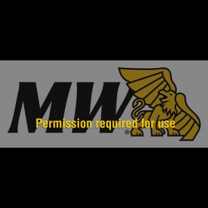
MoWest Logo
![]()
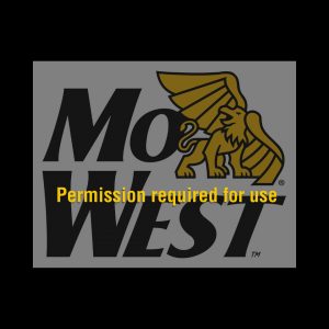
MoWest Centered Logo
![]()
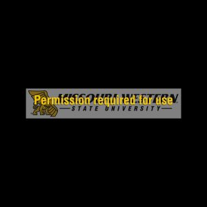
MoWest Wordmark

All university divisions or departments must use an official MoWest Department/Division Lockup. No other marks or alternate versions may be created and used as a logo to represent a university entity.
All requests for MoWest unit lockups must be submitted to Marketing and Communications.
Unit Lockup

The Stacked MoWest Logo and MoWest Lettermark are secondary marks that should only be used in layouts with unique needs or space constraints. These marks should never be used as a primary introduction to the brand.
All usage of secondary marks must be submitted to and approved by Marketing and Communications.
Secondary Marks
The full name MWSU Logo and MWSU Horizontal Logo may only be used for situations requiring the highest level of formality. Review the Name Usage section of this document to determine if a formal mark is appropriate. All usage of formal marks must be submitted to and approved by Marketing and Communications.
Formal Marks

For more details about logo usage, including other limited-use marks, clear space and minimum sizes, color variations and common misuses to avoid, please see the full MoWest Brand Guide, adopted in July 2025.
Black and gold have long been MoWest’s identifying colors. Griffon Gold and Griffon Black should comprise the majority of color usage in all university communications.
The Secondary Colors may only be used as an accent to the primary palette. They may not be used in place of Griffon Gold and/or Griffon Black.
PMS Uncoated Colors for Printed Materials
Griffon BlackPMS Black |
50% | 20% | |
Griffon GoldPMS 123C |
0C/23M/100Y/0K | 50% | 20% |
Centennial SilverPMS 429C |
|||
Kelley Commons SkyPMS 631C |
|||
Fall LeavesPMS 159C |
Due to the difficulty in reproducing the yellow gold on different papers, two different inks should be used depending on the paper choice.
- On coated paper (glossy, shiny paper) the Griffon Gold is (PANTONE ® Matching System) PMS 123C.
- On uncoated paper (such as paper used in an office copier) the Griffon Gold is PMS 109U.
- When four-color process inks are used, Griffon Gold can be produced by printing: 0C/23M/100Y/0K.
RGB and Hex for Screens and Web
Griffon BlackRGB: rgb(0,0,0); |
RGB: rgb(51,51,51); Hex: #333333; |
RGB: rgb(224,224,224); Hex: #e0e0e0; |
|
Griffon GoldRGB: rgb(255,199,0); |
RGB: rgb(255,237,175); RGBA: rgba(255,199,0,0.5); Hex: #ffedaf; Hex w/ Alpha: #ffc70050; |
RGB: rgb(255,248,223); RGBA: rgba(255,199,0,0.2); Hex: #fff8df; Hex w/ Alpha: #ffc70020; |
|
Centennial SilverRGB: rgb(174,178,183); |
|||
Kelley Commons SkyRGB: rgb(84,175,203); |
|||
Fall LeavesRGB: rgb(217,114,69); |
MoWest’s brand fonts are the Aktiv Grotesk Condensed family. Our web-safe alternative is Oswald.
The MoWest brand fonts can be accessed from Adobe Fonts through the Creative Cloud desktop application. Oswald can be found on Google Fonts.
New official MoWest stationery for letters, envelopes and business cards available upon request, submit project request form
For additional details, please consult the complete MoWest Brand Guide in PDF form.